Color in Interior Design: How Shades Shape Mood and Behavior
A home’s interior is not just about style, furniture, or layout. One of the most powerful yet often underestimated tools in space design is color. Its impact on mood, perception, and even human behavior has been widely studied by psychologists and designers alike. Color can create a calm atmosphere, stimulate action, trigger memories, and even influence physiological responses. In this article, we’ll explore how color shapes the emotional backdrop of a room, how to use shades wisely, and what specialists recommend for various home zones.
Color as a Psychological Tool in Interior Design
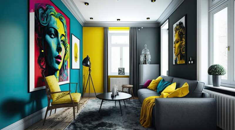
Color affects people on a subconscious level. It is perceived not only visually but also physically: cool shades can lower blood pressure and heart rate, while warm ones stimulate and energize. Every color carries associations formed by culture, personal experience, and physiology.
Psychological properties of colors:
- Red — stimulates, associated with energy, passion, danger
- Blue — calms, enhances concentration, cools
- Yellow — activates intellect, evokes joy, symbolizes sunshine
- Green — balances, symbolizes nature and harmony
- Purple — inspires, evokes luxury and imagination
- Orange — motivates, stimulates appetite, encourages sociability
- White — purity, light, spaciousness
- Black — protection, elegance, strength
Table: Colors and Their Emotional Impact
| Color | Emotional Effect | Recommended Areas |
|---|---|---|
| Red | Energy, passion, excitement | Accent elements, kitchen |
| Blue | Calmness, focus | Bedroom, workspace |
| Yellow | Joy, cheerfulness, creativity | Kitchen, children’s room |
| Green | Harmony, freshness, restoration | Living room, bathroom, bedroom |
| Purple | Creativity, meditation | Study, relaxation area |
| Orange | Warmth, friendliness | Dining room, living room |
| White | Spaciousness, neutrality | All rooms |
| Black | Depth, structure | Accents, workspaces |
The Effect of Tones on Behavior
Not just color but also its saturation and temperature play an important role. Saturated tones energize, while pastels relax. Warm colors (yellow, red, orange) stimulate activity and conversation, while cool ones (blue, green) promote concentration and rest.
Behavioral influences:
- People linger longer in warm-toned spaces
- Cool colors reduce impulsiveness
- Bright tones increase alertness, especially in work zones
- Monochrome palettes help regulate emotional swings
Table: Behavioral Responses to Color Schemes
| Color Scheme | Behavioral Effect | Best Suited For |
| Warm and saturated | Enhances activity and sociability | Kitchen, living room |
| Cool and light | Promotes relaxation and calm | Bathroom, bedroom |
| High contrast (accents) | Increases alertness and dialogue | Workspaces, meeting areas |
| Neutral monochrome | Reduces anxiety, improves mental clarity | Office, minimalist interiors |
List: Common Color Selection Mistakes in Interiors
- Overusing intense colors over large areas
- Ignoring lighting conditions that affect color perception
- Not considering psychological and behavioral color effects
- Blindly following trends without personal alignment
- Mixing too many bright shades without balance
List: How to Choose Colors Based on Mood and Intent
- Want to relax? Use green, blue, or beige
- Need to focus? Try light gray, sky blue, white
- Lacking energy? Add yellow and orange accents
- Seeking stability? Choose brown and terracotta
- Craving brightness and space? Work with white and pastels
Color Harmony and Combinations
Creating a harmonious space requires not only understanding color psychology but also knowing how to combine shades. Designers often use the 60-30-10 rule:
- 60% — main color (neutral or soft)
- 30% — secondary (to support the mood)
- 10% — accent (bright, emotional)
Harmonious combinations bring a sense of completeness and comfort, while poor coordination causes irritation and fatigue.
Color as Part of Interior Identity
Color choices reflect inner states. Introverts often feel more comfortable in soft, calming palettes, while extroverts are drawn to bold, dynamic ones. Color helps bring life to an interior, giving it character and emotional depth.
A well-designed interior is not just “pretty.” It’s an emotionally intelligent environment where you can breathe, rest, create, and be yourself.
Color is a powerful tool for shaping not just the visual appeal of a space, but also the internal state of its inhabitants. It affects mood, behavior, energy levels, and even sleep quality. When you choose your color palette consciously, you create a home that is not just functional, but also supportive, inspiring, and authentically yours.
Pay attention to your emotional reactions to color, experiment with tones, and trust your intuition — and your home will become not just beautiful, but a harmonious extension of your personality.